
Ranking the Flyers’ Alternate Jerseys Through the Years


As we wait for hockey to return, the Flyers created some buzz (along with the rest of the NHL) as they unveiled their newest jersey this week.
Going with the theme of “Reverse Retro”, the Flyers decided to pay tribute to their 1995 road jerseys but with a new colorway.
The Flyers have introduced a handful of alternate jerseys over the years, especially recently as they’ve unveiled their 50th-anniversary jerseys and two Stadium Series sweaters over the past four years.
With all the recent talk about jerseys, let’s look back and rank the Flyers’ best (and worst) alternate jerseys of the past.
8) 2002-07 “Chrome Logo”

In my opinion, there really aren’t any bad Flyers jerseys. For the most part, they’ve been pretty safe but the chrome logo jersey they wore in the mid-2000s was definitely not good. It was one of the two occasions that the Flyers logo has been changed over their 53-year history and it did not go well.
While this definitely isn’t an ugly jersey, especially compared to some other teams around the league, this was certainly a forgettable jersey for the Flyers.
7) 2016-17 “50th Anniversary”
Celebrating their 50th season, the Flyers added gold to their color scheme. Essentially, they just took their current road jerseys and adding gold numbers and outlines.
Though it wasn’t bad as it seemed when the jerseys were first released before the 2016-17 season, orange and gold simply just don’t go together.
6) 2019 Stadium Series

Marking the second time, they’ve changed the Flyers’ historic logo, the team opted for more of a “color rush” look. Going with all orange and black, this also became their only jersey without white anywhere on the uniform.
The lack of white, makes the jersey a little flat, in my opinion, but they certainly looked better once we could see them on the ice. The fact that the Flyers came back and beat the Penguins in these jerseys also makes them a little more memorable.
5) 2017 Stadium Series
There’s just something about the Flyers in black. It just works. These jerseys were incredibly simple but sharp at the same time.
My only question is why are the numbers on the sleeve so big?
4) 2010 Winter Classic
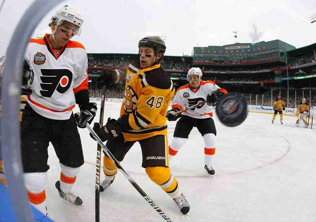
Now their current road jerseys, many forget that these made their return in the 2010 Winter Classic at Fenway Park. These jerseys go back to the Flyers’ roots and bring back the look of the early years of the team with a slight change to the nameplate on the back.
3) 2008-10 “1970s Throwback”
While the 2010 Winter Classics brought back the original away jersey, 2008 marked the return of the original orange color in their alternate jersey. Black takes a backseat as they go back for their original orange and white look.
This jersey became so wildly popular that they became the Flyers’ home jerseys in 2010 and still are today.
2) 1997-01 Alternate

With many teams adopting a black jersey in the ’90s like the Capitals, Sabres, Blackhawks, and Ottawa, the Flyers went the same path and unveiled their first black jerseys in 1997.
They were new and different than what the Flyers had donned for over 30 years and with players like Lindros and LeClair donning them as they dominated the league, these jerseys are very nostalgic to most Flyers fans.
Like some of their other jerseys, these became so popular that they eventually became their home jerseys from 2001-2010 before they were retired.
1) 2012 Winter Classic
I hope whoever came up with this jersey, got a raise. These were beautiful when they were unveiled in 2010 and still are over 10 years later.
Opting to go with cream instead of white gives it a retro-modern look and the Flyers decided to keep it as an alternate until 2016 thanks to its popularity.
While they may have lost the 2012 WInter Classic, at least they looked good doing it.
Featured Image: ---
Discover more from Philadelphia Sports Nation
Subscribe to get the latest posts sent to your email.

Categorized:Flyers Unique Columns